I saw test tubes in the mood board, I was felling like I should get ready for Halloween and I came across the test tube set at Michael's one Sunday. The above photo was taken in a "tent" made of a blanket and jackets while using a black light to show some glow. I need to take a photo of it's "natural" glow, but I'll have to wait until tonight. But I really wanted to get this in the Creative Embellishments Challenge!!
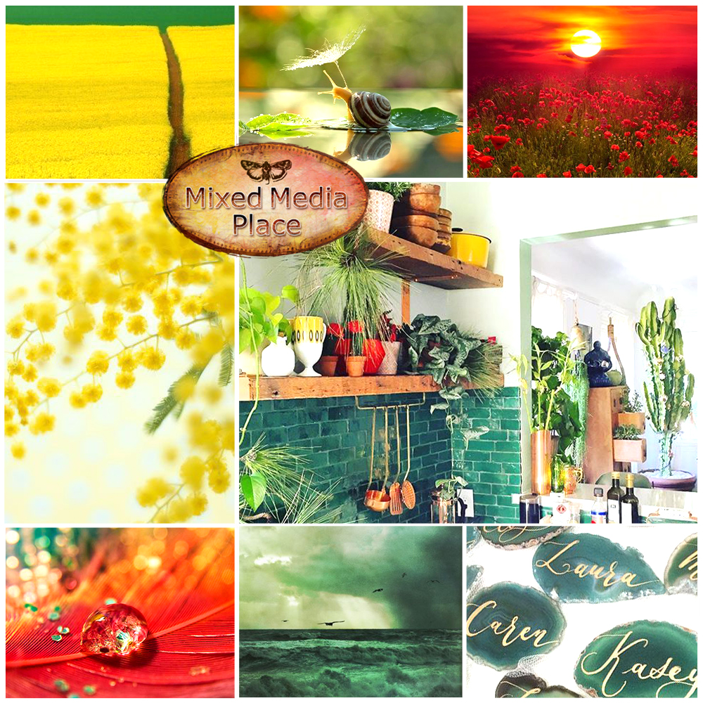
Maybe it's the fact that I feel like summer is never going to end where I live, but the second and third photo on the top row of the Mixed Media Place mood board, at first glance, looked like ice on the foliage. I'm not exactly a person who likes being cold, and I live in a southern state, but I've had it with summer this year! It's the middle of September and we are still hitting the mid-90s! Which, according to the weather last night, is a full ten degrees above average! Too, too much I tell ya!
Beside the thought of ice, I really loved the colors in general on the mood board! It's filled with most of my favorites! But once I had blue + white + ICE!! on my mind, I had to go with it! Below the mood board you will find a process video, some more photos, and a full product list.
Process Video:
Close-up Photos:
Products
AB Studio
Chipboard Background 30x30 (centimeters) ID-4
Creative Embellishments
Holly and Berry Flourish
Shimmerz
Vibez
Frost Bite
Snow Way Man
DecoArt
Weathered Wood
Crackle Medium
Ranger
Tim Holtz
Distress Crackle Paint
Clear Rock Candy
Distress Glitter
Clear Rock Candy
Embossing Powder
Blue
Snowflake Tinsel
Simon Says Stamp
Embossing and Watermark Ink
Clear
Krylon
Workable Fixatif
Liquitex
Gloss Gel
Unknown
All the artificial foliage. I bought it at JoAnn's ... last year.
Over on the More Than Words Challenge blog this month we were tasked with finding inspiration from the word "Origins" and using the colors of our country. I love genealogy, so for me "Origins" is "where did I come from?" I love seeing faces of people I never knew and finding some resemblance!
For this project I used a photo from Ancestry.com of my great-great grandparents and eight of their ten children and maybe a grandchild (the youngest being held). Based on records on Ancestry.com, this photo is over 104 years old. (The youngest girl passed away in 1905 at only 12 years old.)
I chose this photo for this project for a couple of reasons. First, it is representative of the Cherokee I have in my family history. Besides the red, white, and blue of the United States, I (tried to) incorporate the colors of the flag of the Cherokee Nation, orange, yellow, green, and black. The following is from Cherokee.org's FAQ page regarding the flag and seal:
The seal of the Cherokee Nation was created by an executive Act under Chief Lewis Downing in 1869. The Act calls for the seal to contain a seven-pointed star inside of a wreath of oak leaves, symbolizing the eternal flame of the Cherokee people. The star is not designated to point a specific direction, but in the original version from 1869, it rests on a single downward point. The points of the star represent the seven traditional Cherokee clans. Within the rings of the seal, the words Cherokee Nation, September 6, 1839, are included, recognizing the date of the signing of the first Cherokee Nation Constitution after relocation to Indian Territory, as well as the date of the Act of Union, uniting the Old Settlers and Eastern Immigrant Cherokees into a single Cherokee Nation government once again.
The Cherokee Flag contains the Cherokee Nation seal (see the question above for the full symbolism of the seal) in the middle with seven stars in the outer field along with a single, black star. The seven stars in the outer field represent the seven clans, and the one additional star, which is black, is to remember those who died as a result of the Trail of Tears.
In addition to the Cherokee in my history, the "white" part of this particular branch of my family has been in the United States since before it was the United States! So, there you have it! The colors of my country and what "Origins" means to me!
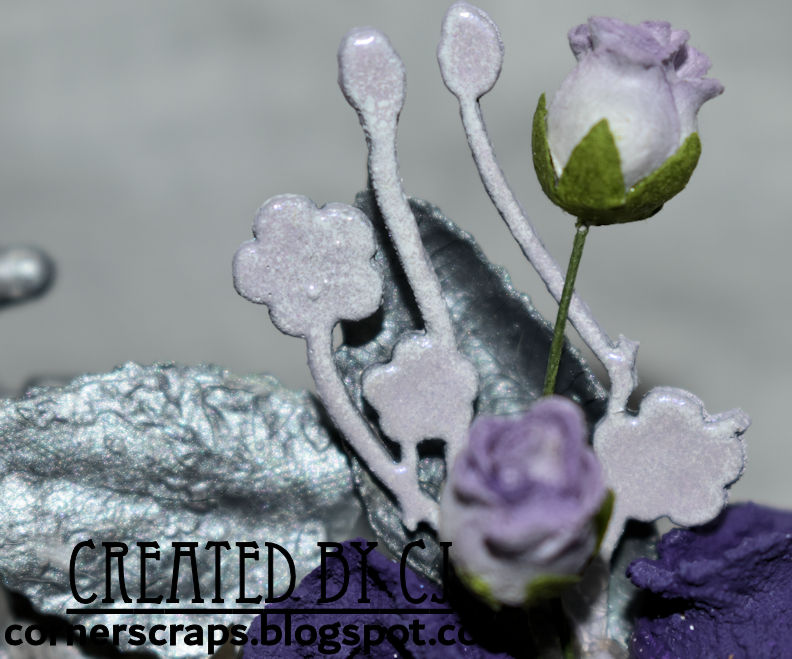
An altered embroidery hoop I created for Linda B. for the August ReneaBoquets Swap! Since Linda and I agreed on an "anything goes" theme, I used the Creative Embellishments August mood board challenge as inspiration. Specifically the Silver & Purple ombré hair. I had planned on trying a green & purple idea, as you'll see at the beginning of the video, but that didn't work out very well, so I assumed it was because the ombré hair was haunting my thoughts!
Process Video:
Close Ups:
Products
ReneaBouquets
Mulberry Paper Flowers
White Gardenia (It was "left over" from a different set of roses)
Purple Spring Mix
Tiny Treasures Butterflies
Polka Dots & Bling
Shard Glitter Glass
Silver
Creative Embellishments
Baby's Breath
Ranger
Tim Holtz
Distress Oxide
Milled Lavender
Mini Blending Tool
Embossing Powder
Lilac Pearl
White
Prima
Finnabair
Rust Effect Paste
Purple
Lavender
Texture Paste
Antique Silver Crackle
Liquitex
Matte Super Heavy Gel
Darice
7" Embroidery Hoop
Unknown/Unbranded
Doily
The "other" roses & leaves that I covered in texture pastes. I received them as a RAK some time ago from Pat G.!
For this project I was inspired by the colors found on the July, Mixed Media Place, mood board, most specifically the yellows, reds, and seafoam green. Especially since the green on the ReneaBouquets Fairy "Belle" was a fantastic match!
Below the mood board you'll find a process video, some close up photos, and a product list.
Process Video:
Close-ups:
And, because she happened to come along, Lucy (Great Dane) is helping to demonstrate how well the mirror works!
"A strong woman looks a challenge dead in the eye and gives it a wink." ~Gina Carey
A quick tag I did for the July More Than Words Mini Challenge using my gel plate, some stencils, thread, a Dina Wakley stamp, and my printer for the quote!