At the start of the swap, when we exchanged addresses, Linny told me her craft room was mauve, burgundy, pink, green, and cream, so I tried to make it so her letters would match her already established decor! (She told me they would go well in her craft room, so mission accomplished!)
Below you'll find the process video, some close up photos, and the full product list!
Process Video:
Close-ups
Products:
[From the] Tres Jolie Cards, Tags, & More Sept. 2019 Kit
Dress My Craft
Vintage Saga
6x6 Collection Pack
Lindy's
Embossing Powder
Oakleaf Olive
ReneaBouquets
Shard Glitter Glass
Pearl
Beautiful Beads
Glass
Cranberry (Gifted to me by Terry in the Nov. 2018 RB Swap! Thank-you, Terry!!)
Mulberry Paper Roses
Green (Don't know the "proper" name.)
Pink Spring Mix
Mini Mermaid Tails (the ivory ones)
The 'other' pink ones (I don't know which set they came from)
Ranger
Perfect Pearls
Blush
Prima
Finnabair
Metallique Acrylic Paint
Red Wine
Texture Paste
White Crackle
Paper
Wax Cire Cera
Sweet Rose
Art Anthology
6x9 Stencil
Lattice
Simon Says Stamp
Embossing and Watermark Ink
Clear
Liquitex
Matte Super Heavy Gel
Matte Gel
JudiKins
Diamond Glaze
Jacquard
Gum Arabic
Unbranded
L & J Wood Block Alpha (Sold by Fantwa, according to my Order History, on Amazon)
Over on the More Than Words Challenge blog this month we were tasked with finding inspiration from the word "Origins" and using the colors of our country. I love genealogy, so for me "Origins" is "where did I come from?" I love seeing faces of people I never knew and finding some resemblance!
For this project I used a photo from Ancestry.com of my great-great grandparents and eight of their ten children and maybe a grandchild (the youngest being held). Based on records on Ancestry.com, this photo is over 104 years old. (The youngest girl passed away in 1905 at only 12 years old.)
I chose this photo for this project for a couple of reasons. First, it is representative of the Cherokee I have in my family history. Besides the red, white, and blue of the United States, I (tried to) incorporate the colors of the flag of the Cherokee Nation, orange, yellow, green, and black. The following is from Cherokee.org's FAQ page regarding the flag and seal:
The seal of the Cherokee Nation was created by an executive Act under Chief Lewis Downing in 1869. The Act calls for the seal to contain a seven-pointed star inside of a wreath of oak leaves, symbolizing the eternal flame of the Cherokee people. The star is not designated to point a specific direction, but in the original version from 1869, it rests on a single downward point. The points of the star represent the seven traditional Cherokee clans. Within the rings of the seal, the words Cherokee Nation, September 6, 1839, are included, recognizing the date of the signing of the first Cherokee Nation Constitution after relocation to Indian Territory, as well as the date of the Act of Union, uniting the Old Settlers and Eastern Immigrant Cherokees into a single Cherokee Nation government once again.
The Cherokee Flag contains the Cherokee Nation seal (see the question above for the full symbolism of the seal) in the middle with seven stars in the outer field along with a single, black star. The seven stars in the outer field represent the seven clans, and the one additional star, which is black, is to remember those who died as a result of the Trail of Tears.
In addition to the Cherokee in my history, the "white" part of this particular branch of my family has been in the United States since before it was the United States! So, there you have it! The colors of my country and what "Origins" means to me!
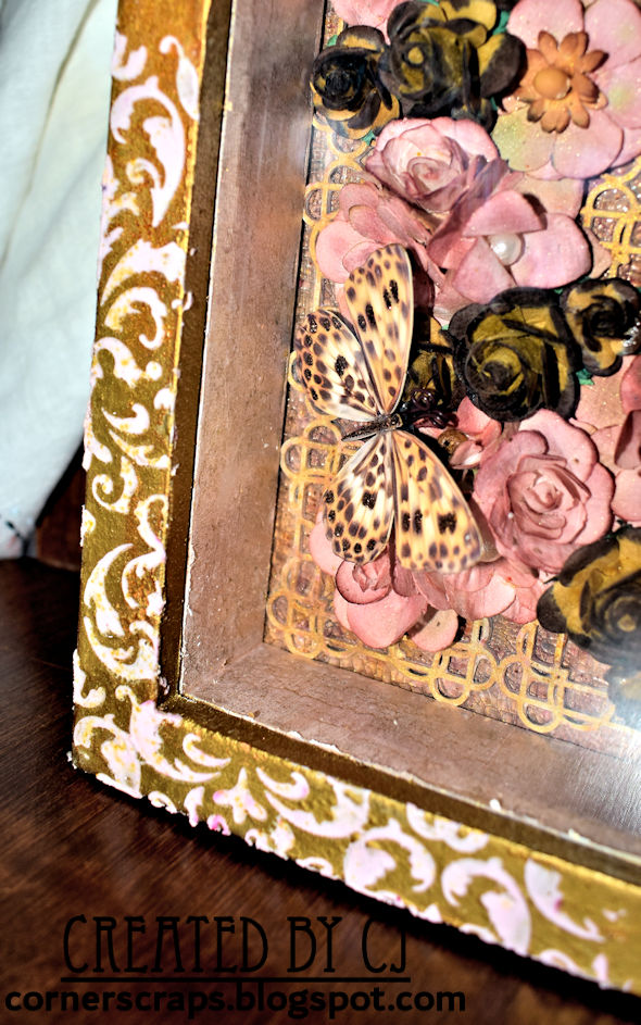
My altered frame for the August Lindy's Gang Color Challenge!
This month for the Lindy's Gang Color Challenge I put together this picture frame specifically to hold a picture of my mom when she was around two years old, standing waist deep in the ocean! (But I blurred her out because her swimsuit didn't fit quite "perfect," and in today's time...*shrug*)
The following Lindy's products can be found on this project (full product list after photos):
Light Pink Mulberry Paper Roses (these specific ones aren't currently listed, so she may be out, or I may have bought "Special Edition" ones. I also don't know the "official" name!)
Chunky Glitter Glass
Diamond (It is mixed in the sand, so it doesn't really show up unless the light hits it just right)
ReneaBouquets and Crafty City are having a collaboration this month (Aug. 2019) called Paradise In August! ReneaBouquets has two "Treasure Boxes" to choose from (Treasure Box #1, Treasure Box #2) that work wonderfully with the Mintay "Paradise" Collection available at Crafty City!
For this project I used items from Treasure Box #1, and I have more than enough to do, at least, two more projects. (For the ideas I have swimming about anyhow!)
After the following photos is the process video, some close-up photos, and a product list.
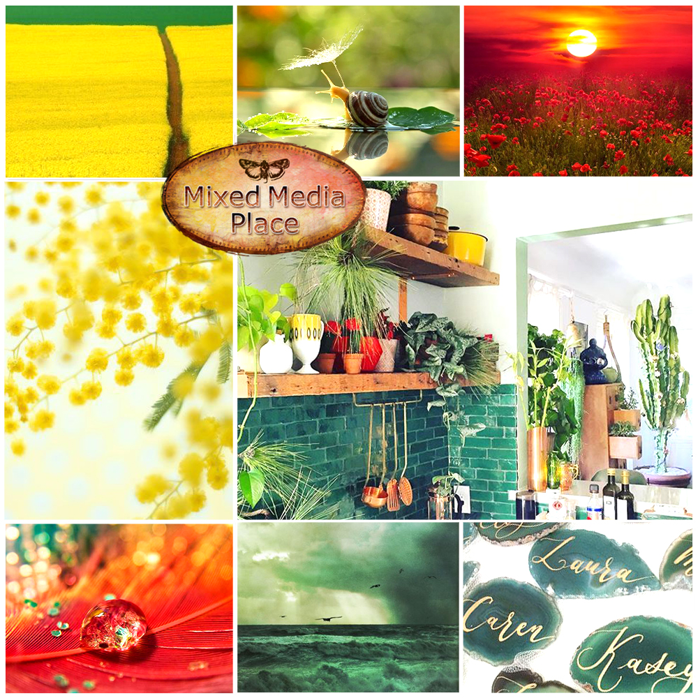
For this project I was inspired by the colors found on the July, Mixed Media Place, mood board, most specifically the yellows, reds, and seafoam green. Especially since the green on the ReneaBouquets Fairy "Belle" was a fantastic match!
Below the mood board you'll find a process video, some close up photos, and a product list.
Process Video:
Close-ups:
And, because she happened to come along, Lucy (Great Dane) is helping to demonstrate how well the mirror works!
Note: Taking photos of reflective surfaces is one of my least favorite things to do!
I created this shadowbox for the July 2019 Lindy's Gang Color Challenge (Info can be found on the Lindy's Blog and Facebook Page). It's my first time doing a Lindy's Challenge, mostly because I need more Lindy's supplies. It's not a lack of wanting to go on a Lindy's shopping spree, it's an "I don't know where it would go" thing. I need to use up some of the items I already own so I'll have spots for new stuff! (However, if I'm lucky enough to win, then the hubs can't question why I bought new items when I am clearly at capacity! "It's not my fault," I'll say, "I was trying to use what I own and this just happened!")
Anyhow, I did happen to have some Lindy's Magical Shakers in Bratwurst Brown, Grab A Guy Gold, and Alpine Ice Rose that I thought would work for this challenge. I "diluted" the Alpine Ice Rose in some white texture paste for the Pale Rose in the color challenge (1st color on the photo below) and used my "new" texture paste for the stenciling on the outside of the shadowbox. I also created the Red Brown (2nd color on the photo below) for the color challenge in a homemade spray by mixing Alpine Ice Rose and Bratwurst Brown, which I sprayed on the (white) Darice flowers.
I used a lot of Bratwurst Brown and Grab A Guy Gold on the outside of the shadowbox, as well as on the background inside the shadowbox. On the lattice, after I gave it a coat of white gesso, I used clear embossing ink on the surface and brushed on more Grab A Guy Gold. (There will be a process video link further down this post which will hopefully explain things a lot better than I can with words!)
My process video:It will go here after editing & uploading. Also, uploads can take a while for me because I have satellite Internet...and to top it off, today is a rainy/overcast day.
However, I do have a few close-ups for you to look at!